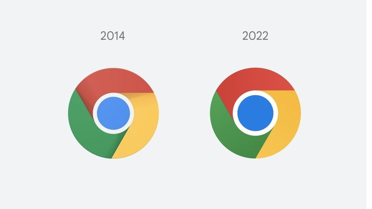
A big update is coming for billions of Google Chrome users worldwide. Elvin Hu, a designer for Google Chrome, revealed a new logo for the web browser last week. The logo looks more vibrant and eye-catchy than ever before. Also Read – Airtel is investing Rs 1.17 lakh crore in India: Here’s what it plans to do
The Google Chrome logo is changing for the first time in eight years. The last time Google tweaked its Chrome logo was in 2014. Compared to the existing logo, the upcoming new Chrome logo looks more vibrant and eye-catchy. However, you will be able to notice the change only if you put your glasses on, and look very closely. Also Read – Google introduces free Workspace plan: Here’s all you need to know about it
Hu said Google considered a fresh design for Chrome, but that didn’t look too appealing. “We explored introducing more negative space. However, in context, the white required a stroke that shrunk the icon overall, and made it more difficult to recognize, especially next to other Google apps,” he added. Also Read – Sundar Pichai has a plan to take Google forward and it involves India
Changes?
The Chrome logo includes red, green, yellow, blue, and white colours, and all of it in the new one look brighter than ever before. If you look at the new logo alone, the difference may not be very visible. But if you compare the existing and the upcoming logos, the difference looks quite clear.
“Some of you might have noticed a new icon in Chrome’s Canary update today. Yes! we’re refreshing Chrome’s brand icons for the first time in 8 years. The new icons will start to appear across your devices soon,” Hu said announcing the change in the Chrome logo for eight long years.
The red, green, and yellow look vibrant and the white border of the center-placed blue circle pops out. The blue colour is also one shade darker. The new logo also doesn’t have the shadow of the red colour bar anymore.
Google Chrome logo: New vs Old
Highlighting the changes in the new logo, Hu said, “We simplified the main brand icon by removing the shadows, refining the proportions and brightening the colors, to align with Google’s more modern brand expression”.
“We also found that placing certain shades of green and red next to each other created an unpleasant color vibration, so we introduced a very subtle gradient to the main icon to mitigate that, making the icon more accessible,” Hu further explained.
ChromeOS vs MacOS
The new Chrome logo looks different for different browsers. “Then, we created OS-specific customizations. We want the icons to feel recognizably Chrome, but also well-crafted for each OS,” Hu said.
On Windows OS, the logo appears with a more dramatic gradient when compared to macOS or ChromeOS. On ChromeOS, the logo uses brighter colours without gradients “to match the looks of the rest of system icons”. On macOS, the logo offers a 3D look in stable build, while beta users will see a blue colour ribbon with “beta” written on it. “The ribbons include many details when viewed at large sizes, but transform into simple badges at small sizes, maintaining their legibility. The letter “B” and “D” representing “Beta” and “Dev” is manually hinted, so they look crisp even at a very small size,” Hu said.
[“source=bgr”]


